Arrows, Bullets, Tabs and Thumbs all have similar “Visibility” and “Position” options, which will be described here in the “Common Options” section for brevity.

Arrows, Bullets, Tabs and Thumbs all have similar “Visibility” and “Position” options, which will be described here in the “Common Options” section for brevity.
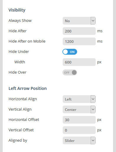
Yes = Show navigation element at all times
No = Only show navigation element on mouse hover
Disable navigation element below a certain screen width. For example, thumbnails look great on desktop, but are often better hidden on smaller screens.
The amount of time in milliseconds before the navigation fades out of view after a “tap” occurs on mobile devices.
Disable navigation element above a certain screen width.
Combining these two options is particularly useful for switching between two different navigation types depending on the screen size:
Tabs -> Hide Below Width -> 850px
Bullets -> Hide Over Width -> 850px
RESULT:
Tabs will be shown above 850px screen size (desktop)
Bullets will be shown below 850px screen size (mobile)
Horizontal Align: Align navigation to the left, right or center of the slider.
Horizontal Offset: Apply a left/right margin to the navigation in relation to its horizontal alignment (positive and negative numbers supported).
Vertical Align: Align navigation to the top, bottom or middle of the slider.
Vertical Offset: Apply a top/bottom margin to the navigation in relation to its vertical alignment (positive and negative numbers supported).
Choose whether the navigation elements should align themselves based on the entire slider’s area, or if it should always be confined to the “Layers Grid” (works the same way as the Layer Responsive Behavior option).
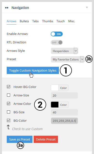
Select #1 to open the custom styles panel.
Then choose the colors and styles you’d like to use for your slider’s navigation (#2)
Then save your favorite set of colors for your selected Navigation Style as a “Preset” (3a), and then reuse your favorite styles for your next slider (3b).
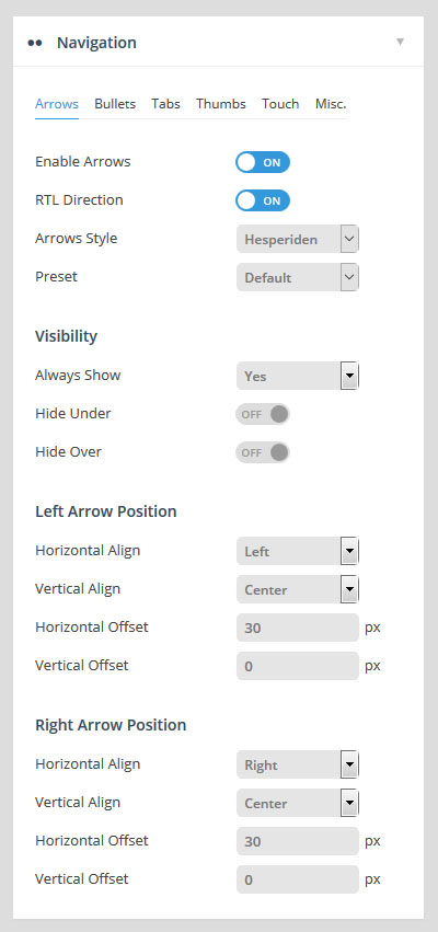
Choose to enable/disable navigation arrows, and if enabled, choose between 15 different pre-built styles.
Change direction of Arrow functionality for RTL Support.
See Common Navigation Options above.
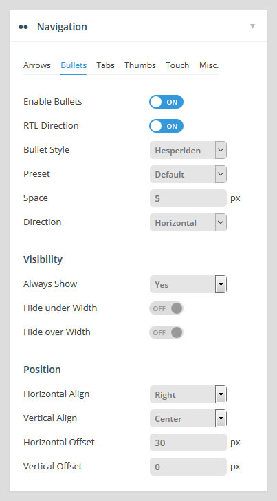
Choose to enable/disable navigation arrows, and if enabled, choose between 15 different pre-built styles.
Change direction of Bullets functionality for RTL Support.
Set the spacing between the bullets in pixels, and choose if the bullets should be displayed horizontally (bullets displayed side by side) or vertically (bullets placed on top of one another) .
See Common Navigation Options above.
Change direction of tab/thumbnail functionality for RTL support.
Wrapper Padding:
Space between edge of slider and edge of thumbs/tabs container.
Span Wrapper:
ON: thumbs/tabs will always be stretched across the full size of the slider.
OFF: thumbs/tabs will be stretched to the slider’s Layers Grid.
Wrapper Color / Opacity
Adjust the color and opacity of the tab/thumbs section. Will only be visible if either “Space” or “Wrapper Padding” exists.
Style:
Choose between 7 different pre-built styles.
Visible Amount:
The amount of thumbs or tabs that will be visibly shown. For example, if you have 7 slides, but only want 3 thumbnails to be displayed, technically the thumb strip will still contain 7 items, but only 3 thumbs will be visible at any given time, and the additional thumbs will only be shown on mouse-movement.
Space / Direction
Set the spacing between the tabs/thumbs in pixels, and choose if the they should be displayed horizontally (side by side) or vertically (placed on top of one another) .
Set the tab/thumb width and height. The width will act as a “Max Width”, and the “Height” will resize proportionally.
For example, let’s say the slider itself was resized down by 50% for mobile. If the thumb width/height were set to 100×50, the thumb size would also be resized down by 50%, and the new thumb width/height would be 50×25.
However, this is where the “Min Width” value is useful. For example, let’s say the thumb width/height were set to 100×50. If the “Min Width” were also set to “100px”, the thumbnails would never resize down.
See Common Navigation Options above.
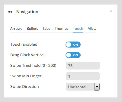
Choose to enable/disable touch navigation for mobile. If enabled, swiping the slider left or right with your finger will change slides back and forth.
Allow for the page to be scrolled vertically when “touch” is enabled. For example, when “ON” is applied, “swiping” the slider in a vertical direction will also scroll the page itself. But when set to “OFF”, the page itself will not be scrolled when swiping the slider in a vertical direction.
Threshold
The swipe action sensitivity. A smaller number would mean that only a short “swipe” is needed for the slide to change. A larger number would mean that a more elaborate “swipe” would need to take place for the slide to change.
Min. Finger
The number of fingers needed for a “swipe” action to be registered. “1” finger is usually best, as that’s what most users are used to, but depending on your site you can require that users use two fingers to “swipe”, etc.
Horizontal:
Traditional left-to-right touch-swipe navigation.
Vertical:
Useful for when your slide animations are set to “Slide Vertical (Next/Previous)”. In this case, swiping up or down would change the slides.
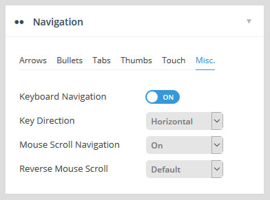
Choose to enable arrow keys to navigate between slides.
Vertical:
Up and down keys will act as “next / previous” controls for the slider.
Horizontal:
Left and right keys will act as “next / previous” controls for the slider.
On/Off:
Capture mouse-wheel movement to change between slides.
Carousel:
Allow for “infinite MouseWheel scroll” for Carousel-based sliders.
Reverse the direction that the slides change when the mouse-wheel is used.