After adding your layer to the slide, use the “Style” section to format text, adjust layer positioning, and also apply additional CSS styles to your layer content.

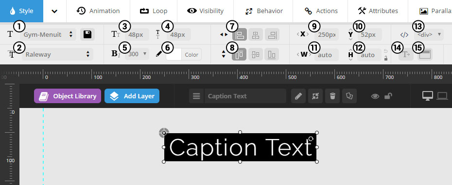
1. Style Template
Automatically apply styling from a list of style template presets.
2. Font Family
Setup your Google Fonts from the slider’s settings section.
3-4. Font Size / Line Height
Font-size can be set in pixels, and line-height is useful for paragraphs of text.
6-7. Font Weight / Letter Spacing
Make your text bold or add some spacing between the letters.
8. Layer Tag
Choose which type of HTML tag should be used for the Layer. Usually “div” is best, but you can also use H1, H2, etc. for enhanced SEO.
9-10. Horizontal / Vertical Aign
Alignment can be based on Layers Grid Size or the entire size of the slider, which is set in the layer’s Behavior section.
* Layer content should always be positioned within the “Layers Grid”. Otherwise the content may bleed off the screen when the slider is resized. Click here for a visual example.
11-12. Horizontal / Vertical Offsets
Offset positions from initial alignments (#7-8). For example, a “Horizontal Alignment” of “center” with a “Horizontal Offset” of 50px would equal 50px to the left of center.
13-14. Layer Width / Height
Entering pixel values will give the layer a predefined size. Or for text layers, enter “auto” for automatic sizing.
15. Text Wrapping
Meant for Layers where text should wrap at a certain screen size. Â Apply a fixed width (#11) Â to use the text-wrapping option.
16. Image Sizing
Useful for applying a “cover” or “contain” background-size position to Image Layers
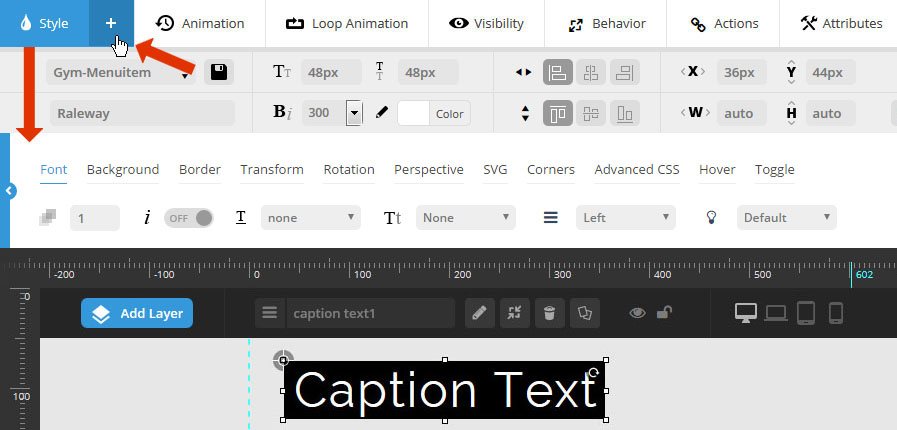
Click the “+” button to activate the advanced styling section.
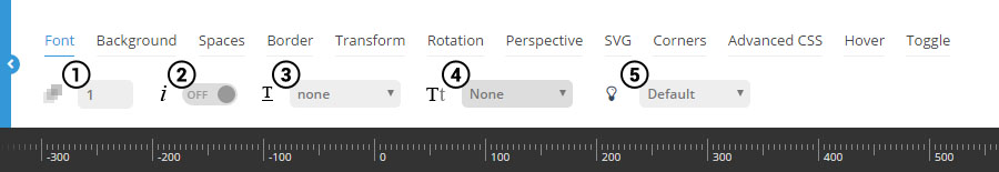
1. Font Opacity
Enter a number between 0-1, such as “0.75”.
4. Text Transform
Capitalize each word, or convert the text to uppercase or lowercase automatically.
5. Layer Selectable
Choose if the text can be highlighted by the user for copy/paste
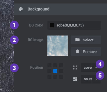
2. Background Opacity
Enter a number between 0-1, such as “0.75”. Or for no background color (i.e. “transparent”), enter the number “0”.
4-5. Background Image
Add an Image from your Magento Media library, or the plugin’s Object Library (not applicable to Image, Video or Audio Layers).


1-4. Paddings
Useful for applying a background to the Layer, and also helpful for improving readability.
5-8. Margins
Useful for apply space between columns and rows.
9. Text Align
Set the text-align for your HTML/Text Layers
10. Overflow
Applicable for content placed inside a fixed-sized container (via Layer Width/Height).
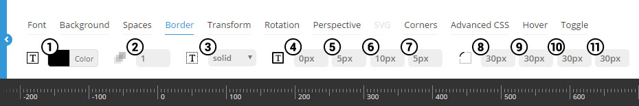
2. Border Opacity
Enter a number between 0-1, such as “0.75”. Or for no background color (i.e. “transparent”), enter the number “0”.
3. Border Style
Choose “solid” for a regular border, and “none” for no border.
4-7. Border Width
Border sizes in pixels for each side.
8-11. Border Radius
Use to achieve rounded corners for your layers. Applicable for when the layer also has a background color applied (see “Background” tab above).
1. Opacity
Apply a transparency level to the entire layer. Enter a number between 0-1, such as “0.75”.
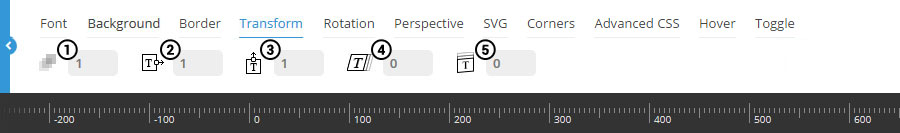
1-3. scaleX, scaleY *
Zoom the layer’s width. Click here for an example of “scaleX”, and here for an example of “scaleY”.
* These transforms work best when both have the same values applied (i.e. scaleX = 1.5, scaleY = 1.5).
4-5. skewX, skewY
Applies a 2D angle to the layer. Click here for an example of “skewX”, and here for an example of “skewY”.
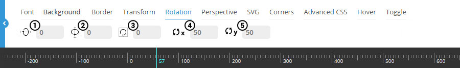
1-2. rotationX, rotationY
Rotate the layer in 3D space:
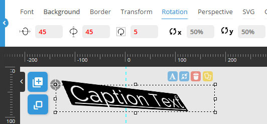
3. rotationZ
Can be used in combination with #1 and #2 above, but can also be used by itself for a traditional rotation (i.e. non-3D).
4-5. Horizontal/ Vertical Origin
Usually “50%” is best. Click here for more information.
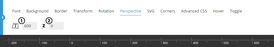
1. 3D Perspective
Adds depth to an object in 3D space. Click here for additional information.
1. translateZ
The layer’s z-axis position in 3D space. Click here to see an example.

1. Blur
Adds Blur Effect to the Layer and the Blur effect’s strength will never become higher than “10px”
2. Grayscale
Adds Grayscale Effect to the Layer and can be adjusted within the range of 0% to 100%
3. Brightness
The Brightness of the Layer can be adjusted within the range of 0% to 150%
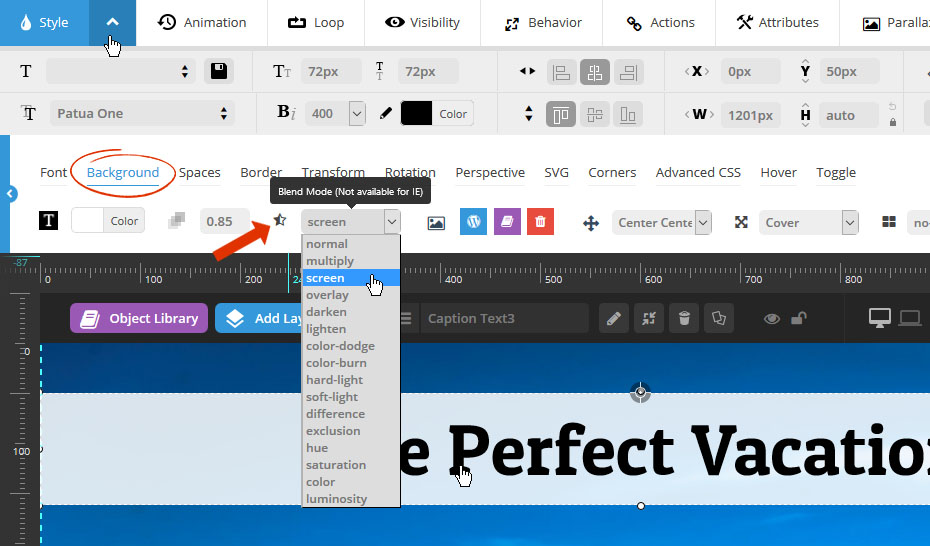
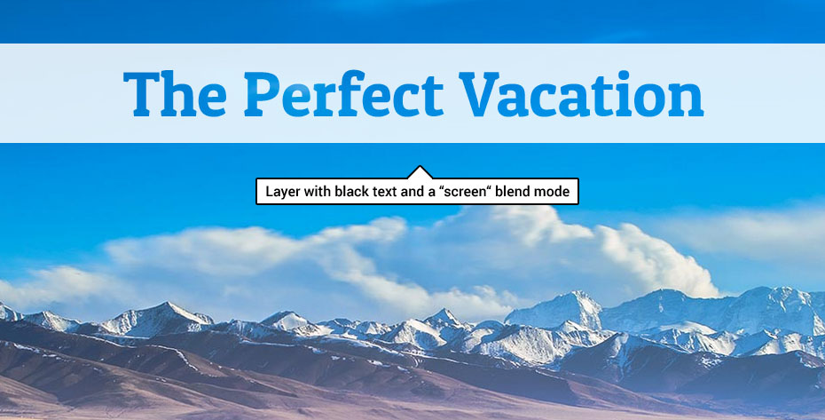
4. Blend Modes
This feature allows you to Blend the color of the Layer with its background. More explanation here regarding the types of Blend Modes
The options here can be applied to SVG Layers, and are for the SVG’s “stroke”. This is similar to a CSS border, but not exactly. Instead, it’s more similar to applying a “Layer Style -> Stroke” in Photoshop.
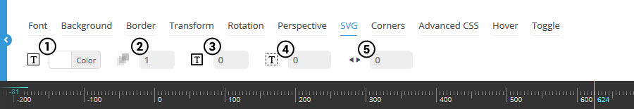
3. Stroke Width
Similar to the CSS “border-width” property in that it’s the amount of pixels used for the stroke.
4. Stroke Dash Array
The amount of dashes to apply to the stroke.
5. Stroke Dash Offset
Rotate the orientation of the stroke dashes.
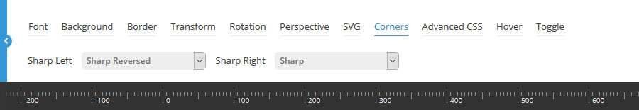
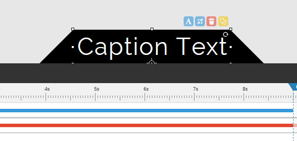
Apply sharp corners to the sides of your layers. The screenshot to the right is a useful example of this, where the layer is positioned at the bottom of the slider.
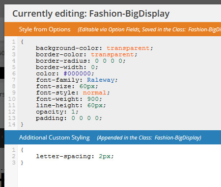
Advanced CSS is in relation to the selected layer style (circled in the screenshot below).
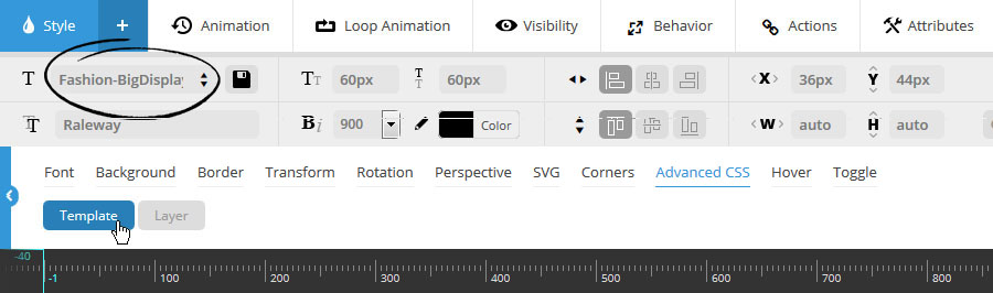
Choose “Template” to modify the CSS for the currently selected predefined layer style.
CSS entered here will be attached to the predefined layer style (i.e. will carry over when used for additional layer content).
Style from Options:
CSS styles automatically applied from the layer’s chosen settings.
Additional Custom Styling:
Add additional CSS that can’t normally be applied through the layer’s WYSIWYG editor.
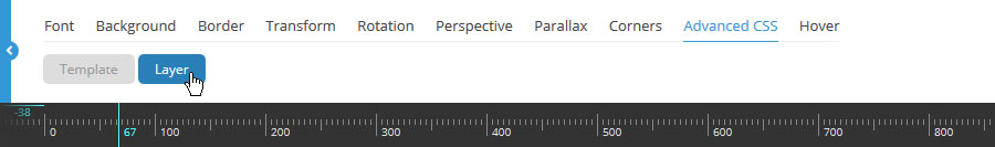
Choose “Layer” to add CSS to this specific layer only.
CSS entered here will not be attached to the predefined style, and therefore will not carry over when the predefined layer style is used for other layers.

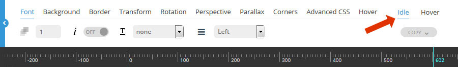
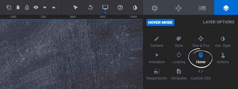
The advanced styling section has two possible “states” where styles can be applied.
The first is “idle”, which will be the default styles for the layer, and the second is “hover”, where you can change the layer’s styles for its mouseover state.
To setup some special styles for the layer’s “hover” state, set “Layer Hover” to “ON”, as shown in the following screenshot:
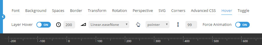
Then once “Layer Hover” is set to “ON”, you’ll see settings for the two states that can be toggled.
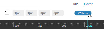
Then you’ll have the ability to set specific styles for both the layer’s “Idle” state (default appearance), and its “Hover” state (mouseover appearance).
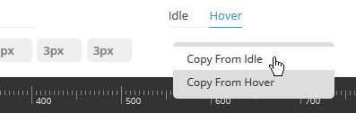
For convenience, click the “copy” button to copy over styles from one state to the other.
For example, if you’ve applied multiple styles to the “idle” state, but only want to adjust the border-color for the “hover” state, click the “hover” state button, then click the “copy” button, and then choose “copy from “idle”.
1-2. Animation Speed / Easing
Idle styles will automatically animate when converted to their hover styles.
“Animation Speed” is in milliseconds, and a number between 200-500 is usually best.
“Easing” is what gives a web animation that “real life” type of movement. Choose between over 35 options to see which one you like best. The most commonly used options are “Power2.easeOut”, and “Power3.easeOut”.
3. Mouse Cursor
The most common choice for a hover mouse cursor is “pointer”, which will be a hand symbol. Other common choices are “auto” and “default”.
4. Z-Index
Specify a z-index for the Layer to help avoid visual and hotspot collisions with other Layers. Lower numbers (starting with 0) represent the lowest in the stacking order, and a high number such as “99” will ensure that the Layer is always displayed on top of all other Layers.
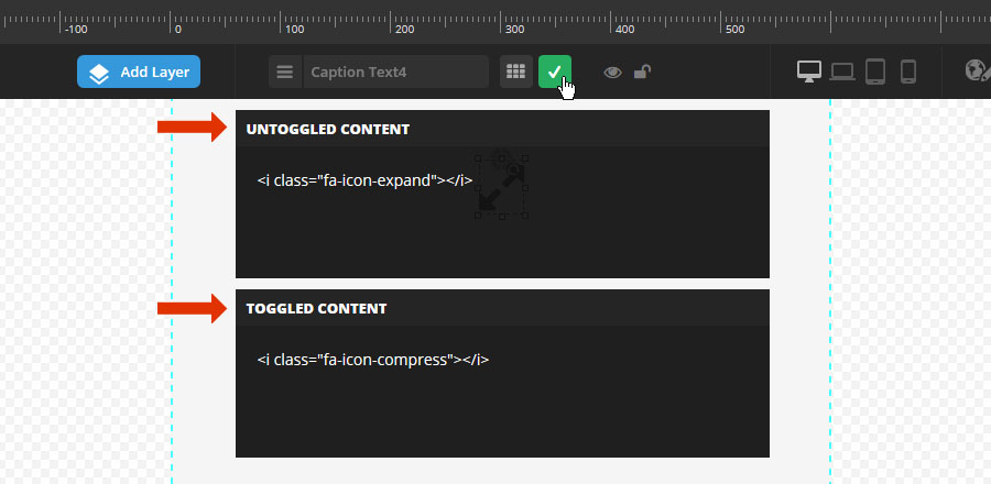
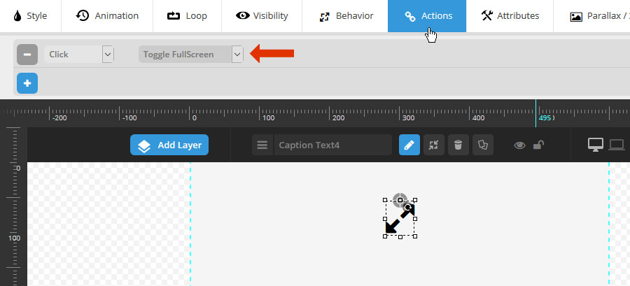
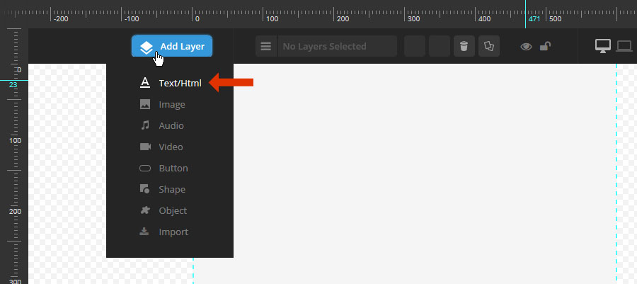
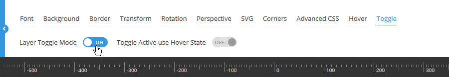
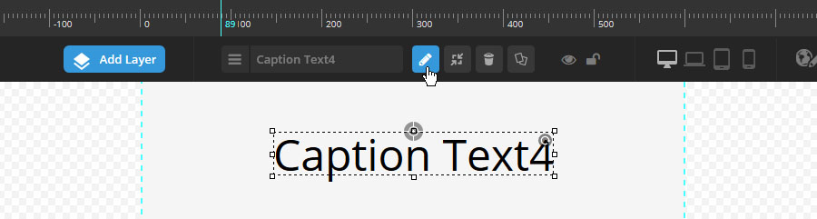
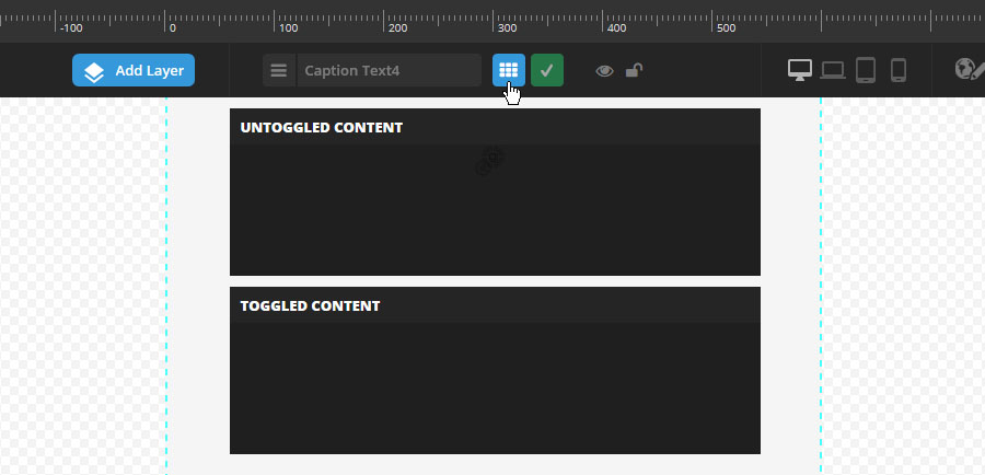
The “Toggle” option is great for switching between content on a mouse click. In the following example, we’ll use the “Toggle” option to setup a “FullScreen” button with two different icon states.