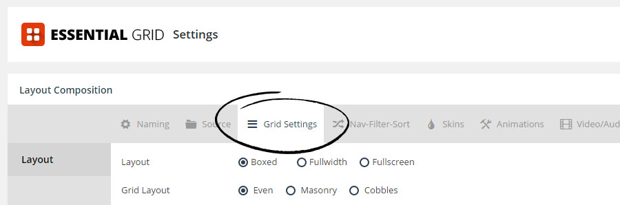
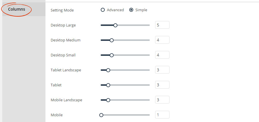
Essential Grid “responsive” behavior works by dynamically adjusting the amount of columns per screen size. And the screen size “break points” are essentially the same as CSS media queries. A total of 7 break-points are available, which will help to ensure that your grids look great on any device.
Column adjustments alter the size of your Grid Items...
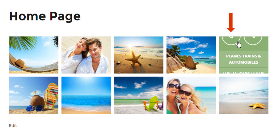
Let’s say you’ve setup the “desktop” to have 5 columns, but based on your Grid Layout, the item content don’t quite fit, like the example below:
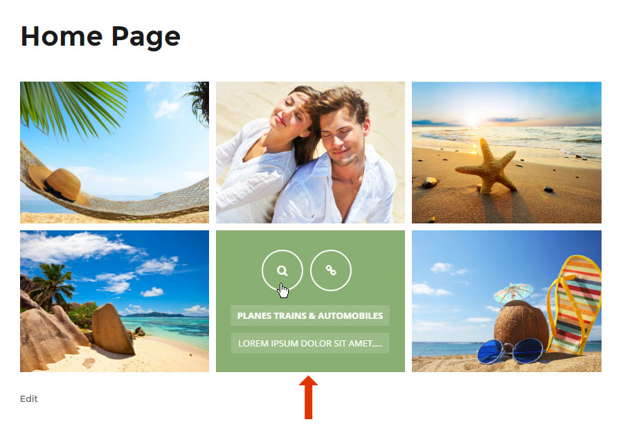
Instead of altering the content itself, with Essential Grid you can simply adjust the number of columns. For the above example, adjusting the number of columns down to “3” will provide more room for the content to fit properly.