
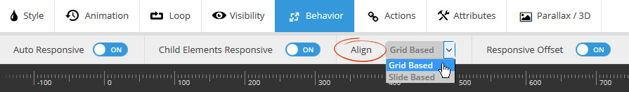
Choose to make the layer responsive by default (layer will resize when slider resizes).

Choose to make the layer responsive by default (layer will resize when slider resizes).
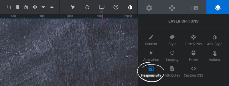
If the layer contains additional content (raw HTML, shortcode from other plugin, etc.), the slider will attempt to resize all nested elements.
Layer Alignment is particularly useful for when using Full Width slider, as sometimes you want your content to align to the sides of the screen as opposed to your slider’s “Layers Grid” size.
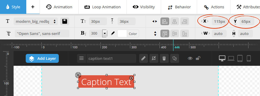
In the following example, the layer has a “top left” alignment, with an “Offset X” of 115px and an “Offset Y” of 65px.
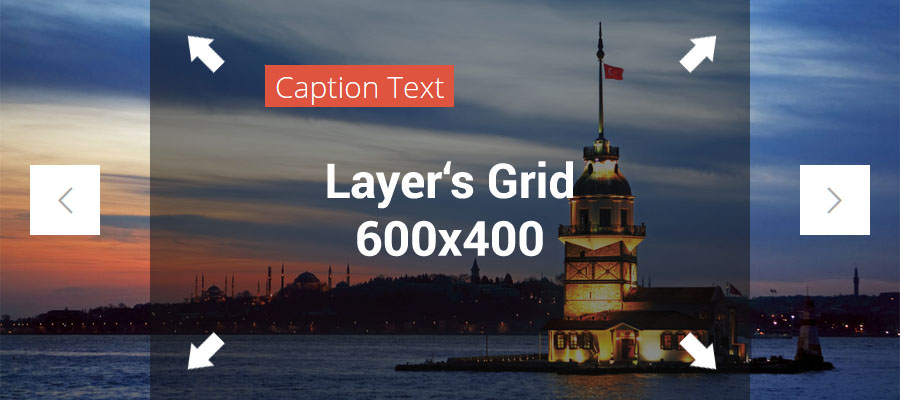
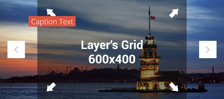
The example slider below has a “Full Width” Slider Layout and a “Layers Grid” of 600×400. When the screenshots were taken, the screen size was 900px wide, so the slider had also “responded” to this width.
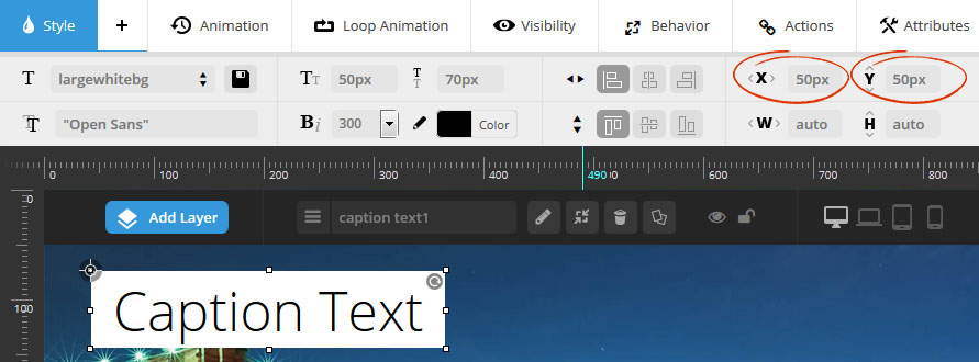
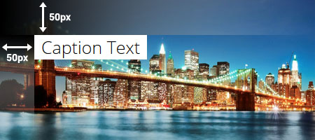
In the following example, the layer has a “top left” alignment, with a 50px offset from the top and left.
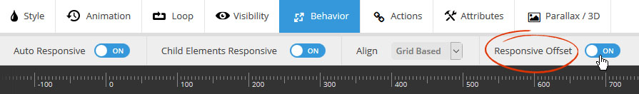
Responsive Offset: ON
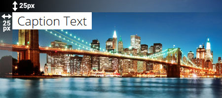
When the slider is resized down by 50%, the Layer’s original “Offset” values are also reduced by 50%.
Responsive Offset: OFF
When the slider is resized down by 50%, the Layer’s original “Offset” values are NOT reduced or changed.
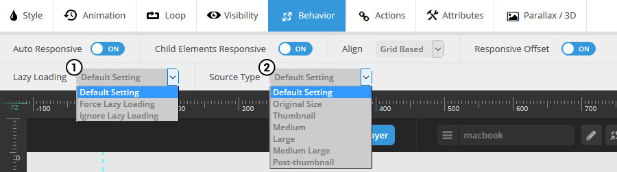
1. Lazy Loading:Â
Default Settings – Image will be loaded according to the slider’s global Lazy Load setting.
Force Lazy Loading – Lazy Load the image regardless of global Lazy Load setting.
Ignore Lazy Loading – Do not Lazy Load the image regardless of global Lazy Load setting.
2. Source Type:
Choose which version of the image should be loaded. Often “Original” can equal a very large file size, so usually “Large” or “Medium” is a good choice for optimal loading performance.
Choose “Default Setting” to use the slider’s global Image Source Size setting. Or override the default setting with one of the other choices.