
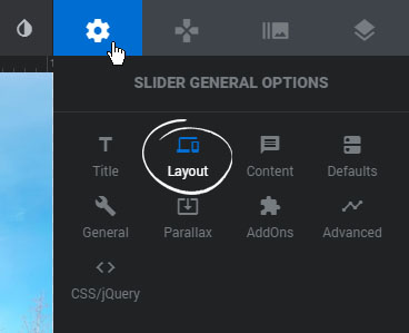
Activate the Responsive Viewports for your Module to position/style content for different screen sizes.
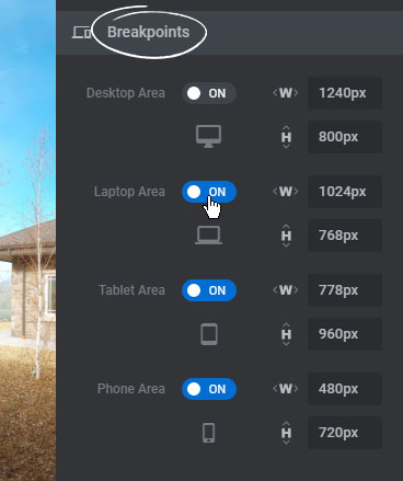
Enable the four available Breakpoints for your Module to activate responsive editing.
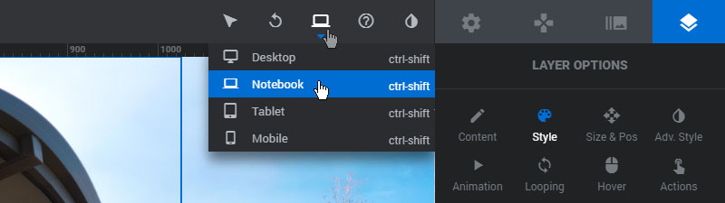
Next, switch between the different Breakpoints and position/style your Layers for each viewport.
Responsive Editing
Now that the Responsive Viewports have been activated for your Module, select a Layer on the editing stage and head over to its Responsive Settings section to adjust its sizing & position behavior for each breakpoint.