Admin Theme Manual
In this document, you will find step by step instructions for installing and using this extension. Thank you for paying attention to this manual. If you have more questions please post your question on CodeCanyon item page and our staff will put its best to help you https://codecanyon.net/
Features
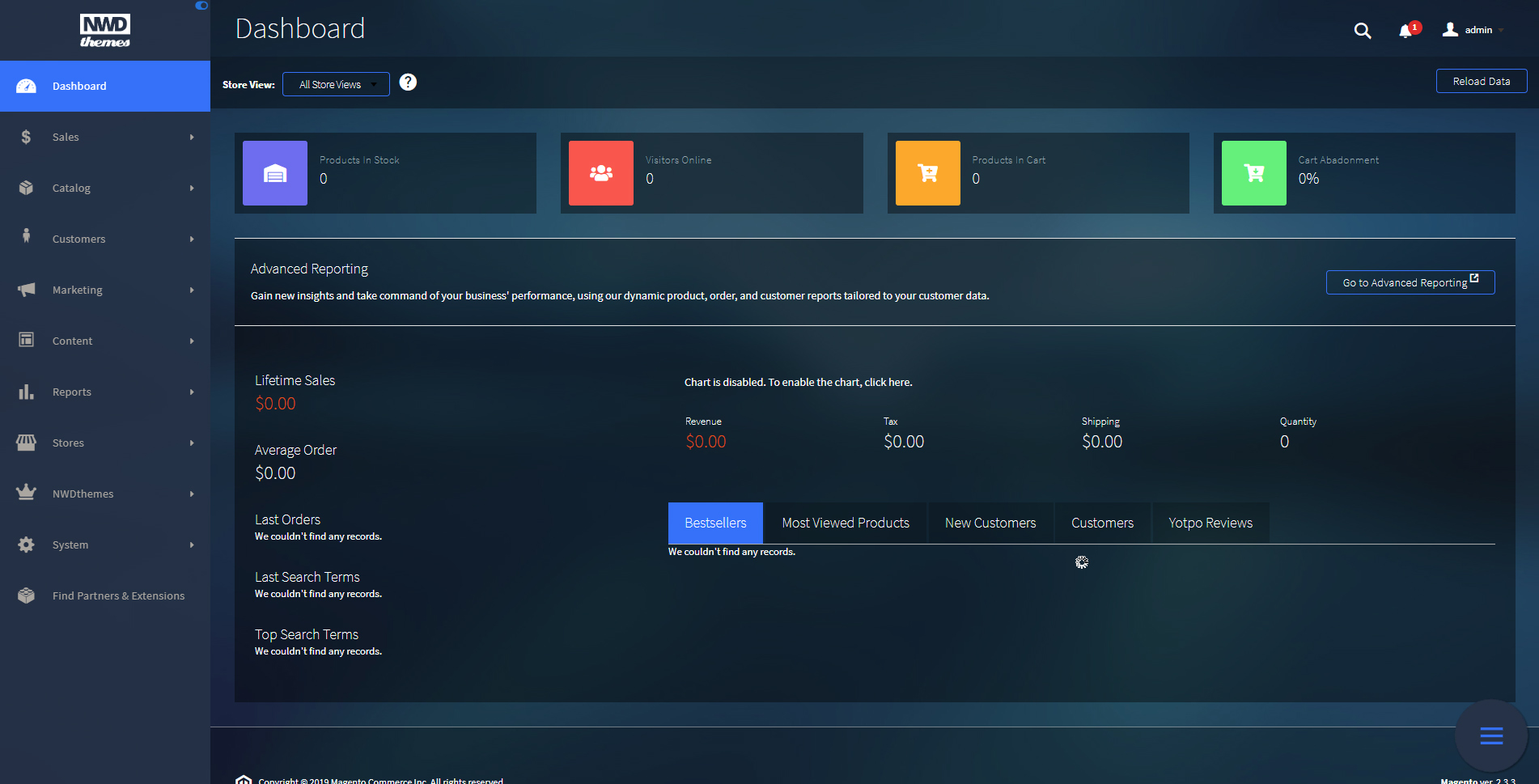
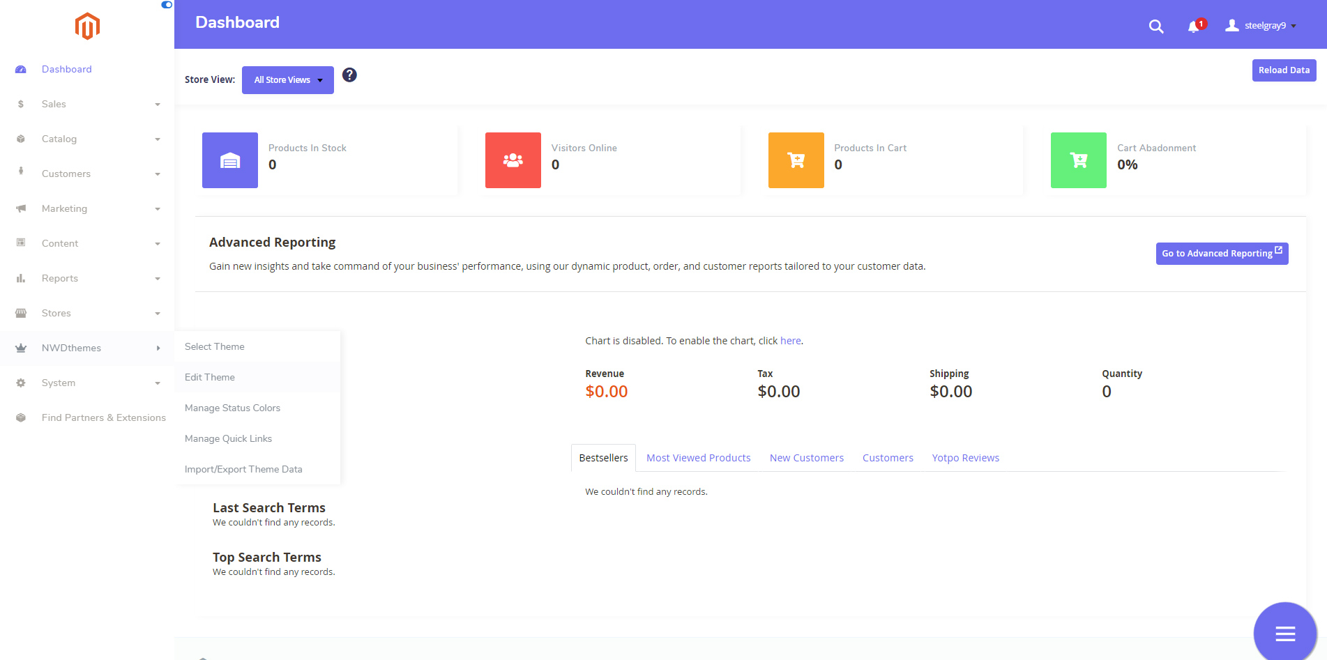
NWDthemes Magento 2 Admin Theme is a lively and user-friendly admin theme. At allow you to customize admin panel look and feel to achieve better usability, work faster & more efficient. Two predefined themes comes in package - Eye friendly dark theme and Clean light theme.
Dark Theme
Light Theme
Quick links feature gives you ability to access certain admin sections in no time. You can easily add a link to add New Product, View Sales Report or access store configuration without navigating thru menu. Both internal and external links are supported.
All of the interface elements are totally under your control. You can change colors of any elements to match your corporate colors and keep admin skin solid with your frontend taste. All customizable elements are grouped by logical sections to let you easier access them.
Give your admin panel a fresh look with NWDthemes Magento 2 Admin Theme!
Full Features List
- Great variety of configuration options
- Two predefined themes: Light & Dark
- Updated login page
- Upload your own logo
- Customize admin theme fonts with 500+ Google Fonts
- Horizontal / Vertical navigation with collapse option
- Customizable navigation icons
- Quick actions - access admin sections in no time
- Custom status colors for orders and products
- Advanced Dashboard statistics
- Import / Export theme settings between your stores
- Outstanding support
Quick Start
- Install Admin Theme - Installation.
-
Navigate to NWDthemes > Admin Theme > Select Theme and select one of the available themes.
-
Edit Theme Settings. Upload your logo, change fonts or colors.
- Enjoy the result!
Package
Extension package contain following files and folders
- Documentation - documentation in html format
- Extension - extension source code
Installation
We do recommend to install and test the extension on development server before installing it on live store
Extension upgrade
To upgrade the extension to the latest version, follow the same procedure as for initial installation (which is described in the next chapter). Always test the upgrade on a copy of your Magento before you upgrade your live store. Never go live with the upgrade without testing.
Before start
Important
It is highly recommended to install the theme on a test server before you install it on your live storeBackup
Backup store files and the store database.- Disable the following options: Merge CSS Files, Enable Javascript Bundling, Merge JavaScript Files and Minify JavaScript Files under Stores > Configuration > Developer.
- Disable Magento cache - Cache Management
- Enable Magento maintenance mode. To enable the maintenance mode you can create an empty file named .maintenance.flag in your Magento's var directory. Magento will be offline after that. You will need to disable the maintenance mode after installation by removing this file.
Refer to Magento documentation for more details:
Enable or disable maintenance mode - Log out from magento admin panel ( if you logged in ).
Install
- Unzip extension package
- Navigation into
package/Extensionfolder - Upload content of
package/Extensionto your magento root directory.package/Extension/app>>magento_root/app
AdminTheme does not overwrite any magento core files
- Set correct file permissions for all the files which you uploaded to your server.
Refer to Magento documentation for more details:
Ownership and permissions - Enable module:
php bin/magento module:enable Nwdthemes_Base Nwdthemes_AdminTheme - Run setup upgrade scripts:
php bin/magento setup:upgrade - Generating static files:
Magento <= 2.1.x
Magento >= 2.2.x - add -f parameterphp bin/magento setup:static-content:deployphp bin/magento setup:static-content:deploy -f - Flush cache:
php bin/magento cache:flush -
AdminTheme is now installed on your Magento system.
Common Issues
Site is down- Following steps will help you to disable the extension
php bin/magento module:disable Nwdthemes_AdminTheme php bin/magento cache:flush php bin/magento cache:clean - If you have other cache services such as Redis, Varnish, please also flush cache of those services.
- Deploy your store if needed.
Uninstallation
Check this article for a common actions list: Magento 2: Uninstall Module
- Remove the folder app/code/Nwdthemes/AdminTheme/
- Remove the folder app/design/adminhtml/Nwdthemes/
- Remove the folder pub/media/nwdthemes/admintheme/
- Drop module tables from database
DROP TABLE IF EXISTS `nwdthemes_admintheme_theme`; - Remove the module from database table setup_module
DELETE FROM setup_module WHERE module='Nwdthemes_AdminTheme' - Remove the module from app/etc/config.php
- Flush cache
php bin/magento cache:flush - Recompile code if you are in production mode
php bin/magento setup:di:compile
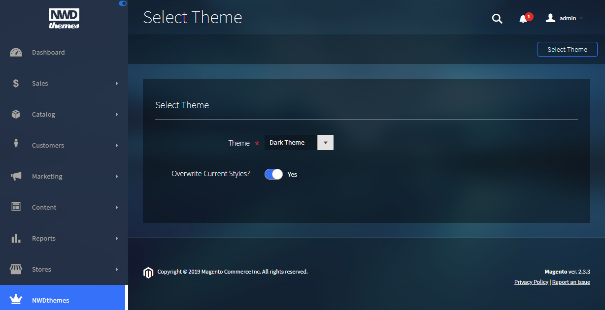
Select Theme
You can select theme via NWDthemes > Admin Theme > Select Theme. 2 predefined themes - Dark and Light.
Dark Theme
Light Theme
Select Theme Form
Theme attributes
Theme - select a theme for admin panel
Overwrite Current Styles? - current theme settings will be reset to theme settings. Status colors and Quick links are not affected
Edit Theme
Basically every part of the page can be customized to meet your design. Fonts, colors, tables, inputs, buttons... You can access current theme settings via NWDthemes > Admin Theme > Edit Theme.
Logo
- Logo Image - upload your logo here. Allowed image file extensions: jpg, jpeg, gif, png.
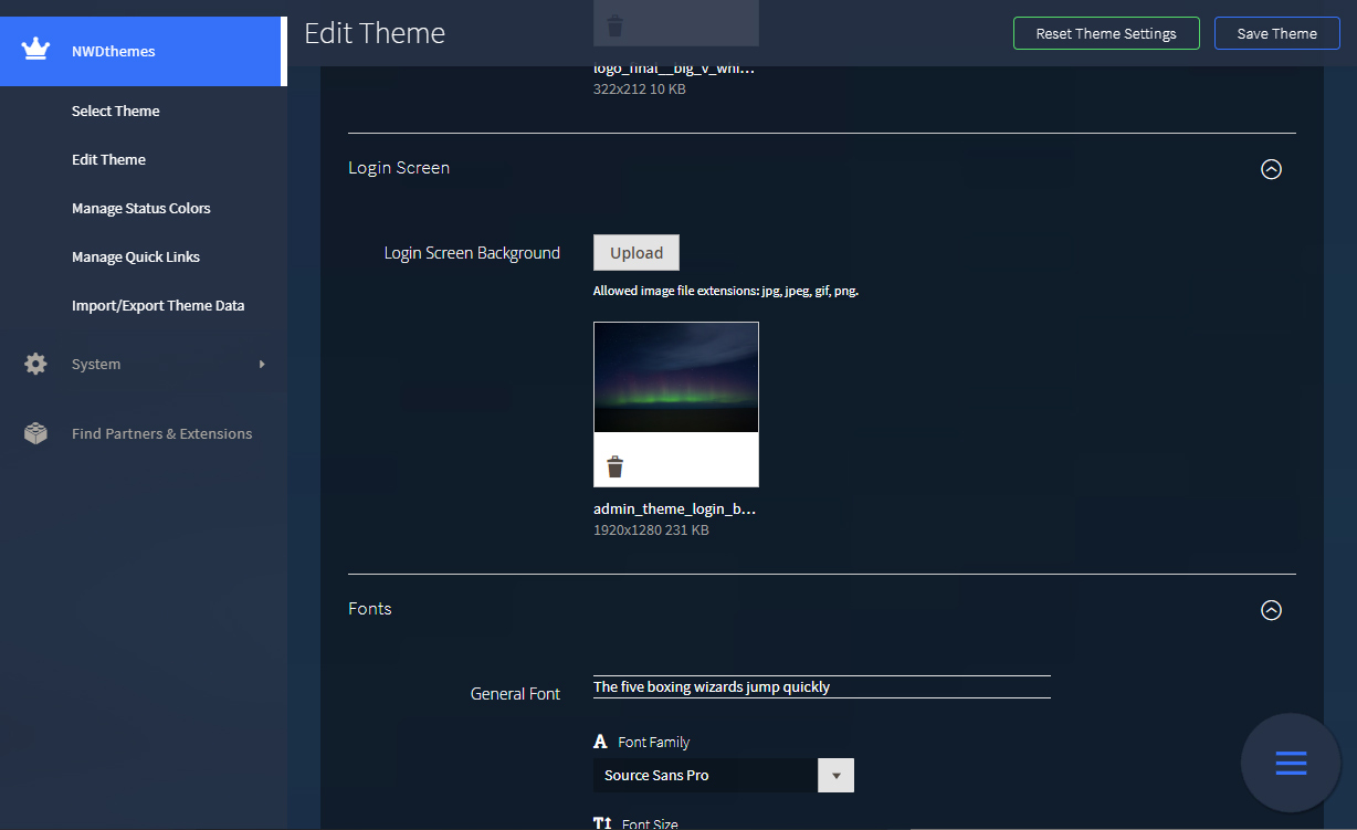
Login Screen
- Login Screen Background - background image of login page. Allowed image file extensions: jpg, jpeg, gif, png.
Fonts
This section gives you option to change font for differents parts of page.
- General Font
- Heading Font
- Navigation Font
- Button Font
Each font has following parameters:
- Font Family - select font family among available fonts
- Font Size - set font size
- Font Weight - set the weight (boldness) of the font
- Line Height - height of font line in px
General Colors
Block Styles
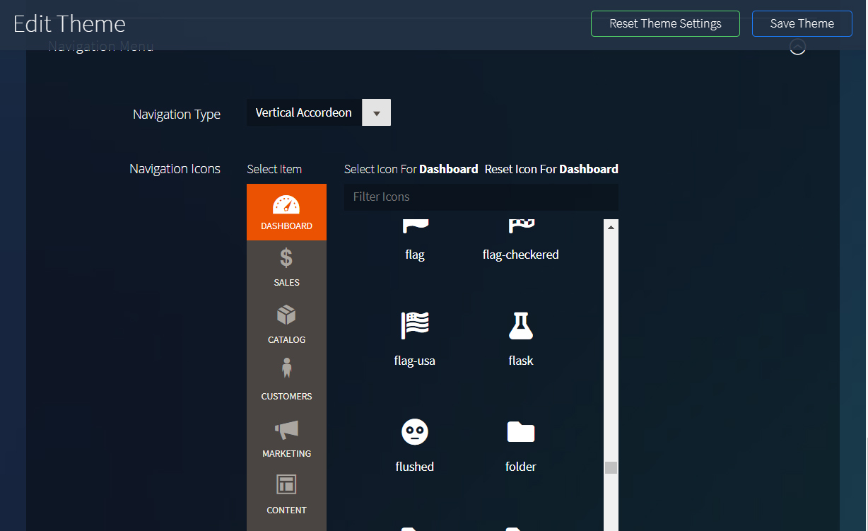
Navigation
- Navigation Type - set navigation type. Available types are:
- Vertical Default - default navigation look
- Vertical Wide - wide vertical navigation with ability to collapse menu
- Vertical Accordeon - vertical accordeon navigation
- Horizontal - horizontal navigation
-
Navigation Icons - you can change navigation item icon to any icon from magento font.
Manage Status Colors
Many orders with different statuses makes it hard to see the status and move to the one that still require action. You can set different status colors for orders and products to quickly see what status an order / product has. Status colors management located in NWDthemes > Admin Theme > Manage Status Colors.
Status Colors Form
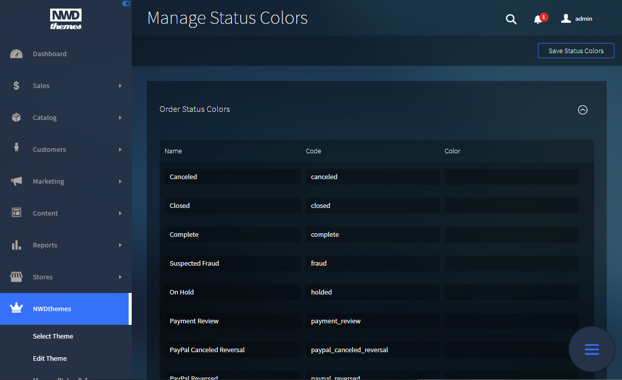
Status color attributes
Name - status name. Pending / Enabled etc...
Code - status code
Color - status color
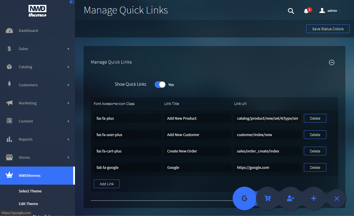
Manage Quick Links
Quick links gives you ability to access certain admin sections in no time. Links management located in NWDthemes > Admin Theme > Manage Quick Links.
Links Form
Show Quick Links - enable/disable quick links functionality
Link attributes
Font Awesome Icon Class - define link icon. Complete icons list can be found at Fontawesome.com
Link Title - Link title
Link Url - Link title
- For internal url you can specify only path -
customer/index/new - For external url specify full url -
https://google.com
Import/Export Theme Data
Import / Export functionality located in NWDthemes > Admin Theme > Import/Export Theme Data. It include theme colors / fonts, order and product status colors and quick links. It does not include images from theme settings. If you are using custom logo or background - you will need to re-upload it.
Import/Export Form
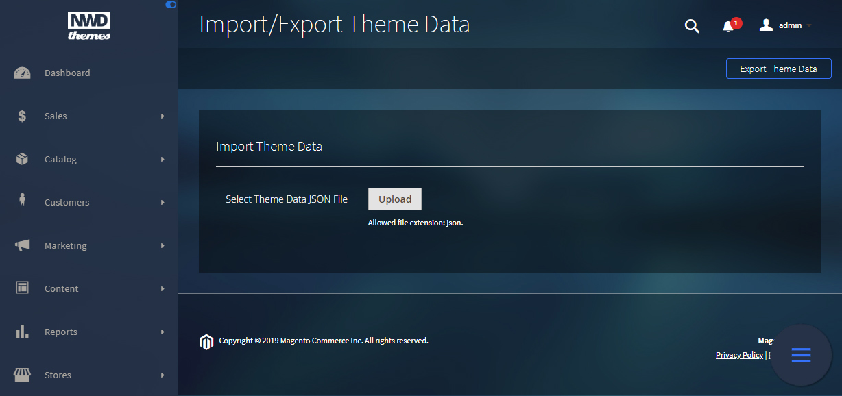
Export Data
To export data you need to click on Export Theme Data button in top right corner.
Import Data
Following fields available in Import form:
Theme Data JSON file - file with theme settings
Help & Support
Please read this documentation carefully, it will help you eliminate most of potential problems with incorrect configuration of the extension and Magento.
If you don't find the answer to your questions, please refer to this chapter for more information about support policy:
Help & Support > Support Policy.
Magento configuration, installation, maintenance, customization etc. is beyond the scope of our support. But since Magento is very popular platform you can find tons of useful tutorials and articles on the web. Here are some resources for start:
Useful links
Documentation
- Basic information about Magento:
https://magento.com/developers/magento2
https://magento.com/products/community-edition - System Requirements:
http://devdocs.magento.com/guides/v2.0/install-gde/system-requirements.html - Magento documentation:
Getting Started
Developer Documentation - Installation Guide:
http://docs.magento.com/m2/ce/user_guide/magento/installation.html
Community
- Magento Forum:
https://community.magento.com/ - Stack Overflow:
http://stackoverflow.com/questions/tagged/magento2?sort=newest - Magento Stack Exchange:
http://magento.stackexchange.com/
Support Policy
Support hours: 10AM – 6PM GMT+1 time, Monday – Friday. The support response time is 24-48 hours.
Support for our items includes:
- Fixing bugs and reported issues
- Responding to problems regarding the item and its features
- Providing updates to ensure compatibility with new software versions
Item support does not include:
- Customization and installation services
- Support for third party software and plug-ins
- Support for Magento: configuration, installation, maintenance etc.