A slider that usually contains images from your Magento Media library, where slides are created and managed individually.

A slider that usually contains images from your Magento Media library, where slides are created and managed individually.

Full tutorial for setting up a post-based slider:

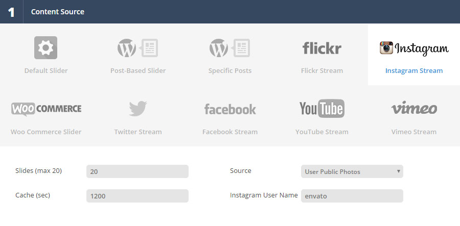
Full tutorial for setting up a Special Content Source slider such as Instagram, Facebook, YouTube, WooCommerce and more:
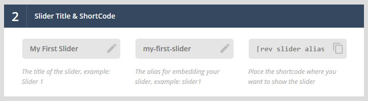
Where the slider’s Title and Alias are defined, and also where the auto-generated ShortCode can be copied and later pasted into the content area of one of your site’s pages.
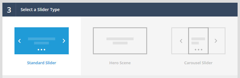
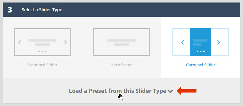
The famous, traditional Slider Revolution.
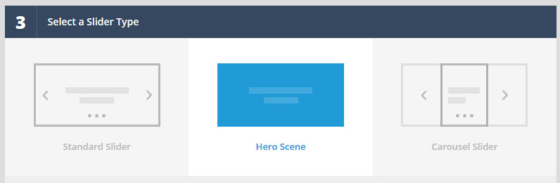
Essentially a “one slide” Slider. When selected, multi-slide options such as navigation, autoplay, etc. will be hidden from the slider’s main settings automatically.
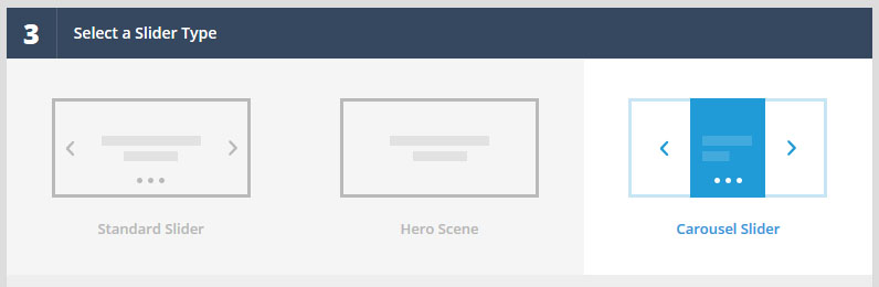
When selected, a new Carousel Settings section will become visible where you can setup a wide variety of carousel views.

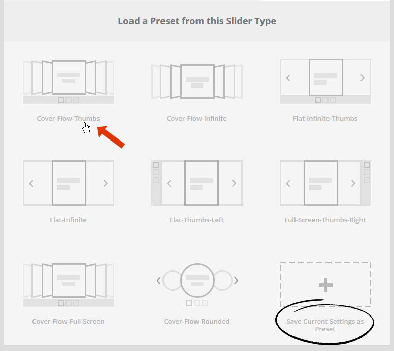
Load a settings preset template for your current slider, or save the slider’s currently selected settings as a preset template to be used for future sliders.
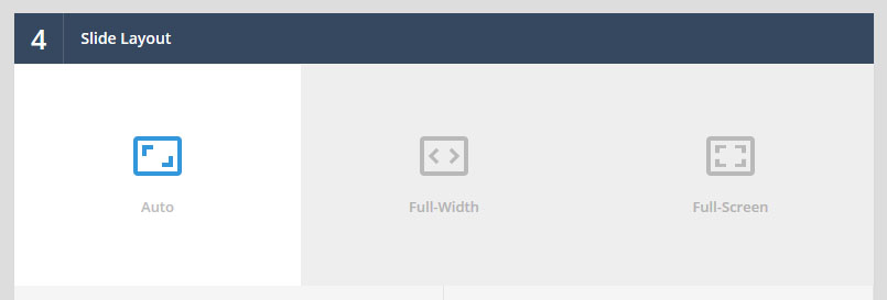
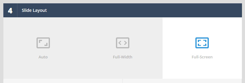
The default “responsive” layout. The slider will always inherit the width of its immediate HTML container, allowing it to fit seamlessly inside your theme’s page layout.
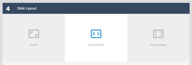
Slider will always stretch across the entire width of the screen.
Slider will always become the same size as the entire screen size.
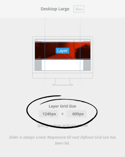
The default Canvas Size for your slider's content.
Click the image below for larger view
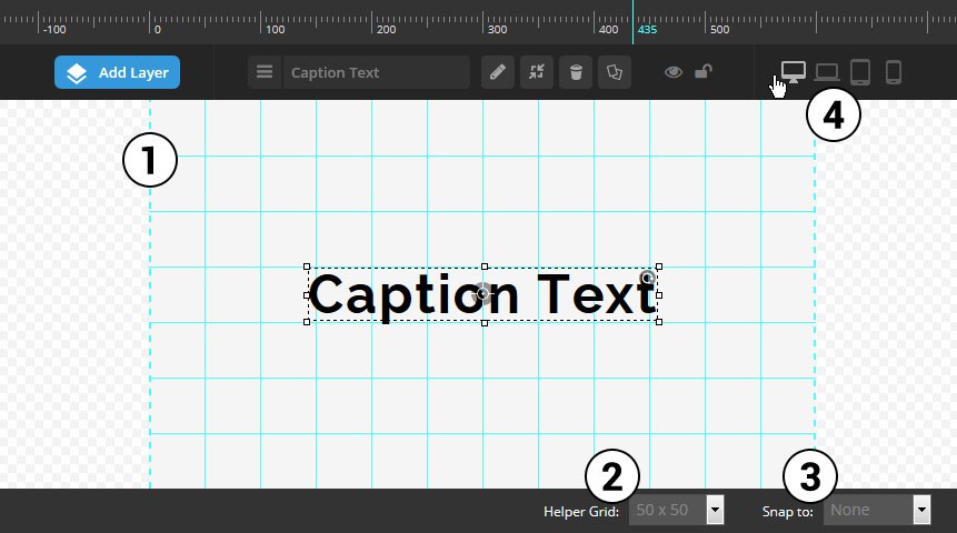

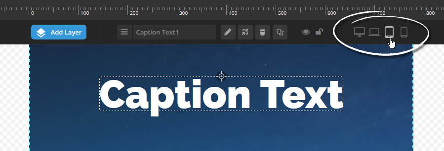
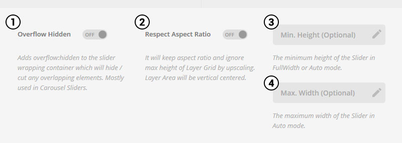
Use Custom Grid Sizes to enable CSS Media Queries for your slider’s content.
Highly useful for setting up your content to look great on mobile devices.
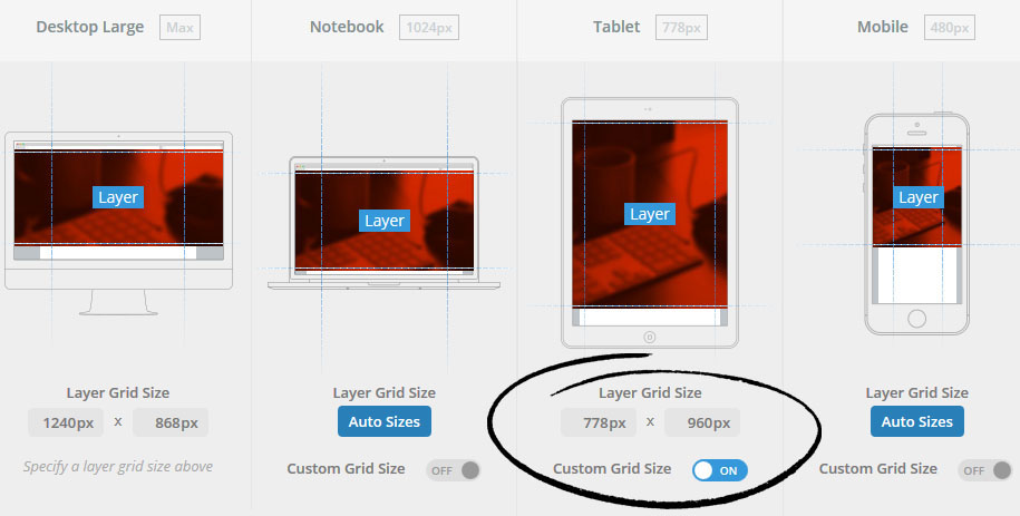
In order to enable the ability to design content for multiple screen sizes, you first need to set the “Custom Grid Size” to “On” as shown in the screenshot above.
Then once you’ve activated at least one “Custom Grid Size”, when you edit a slide, you can set different styles (such as varying font-sizes) for each enabled “Custom Grid Size”.